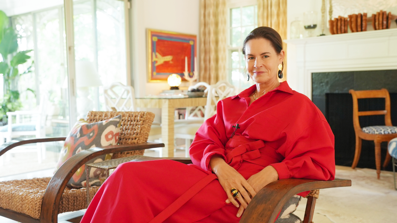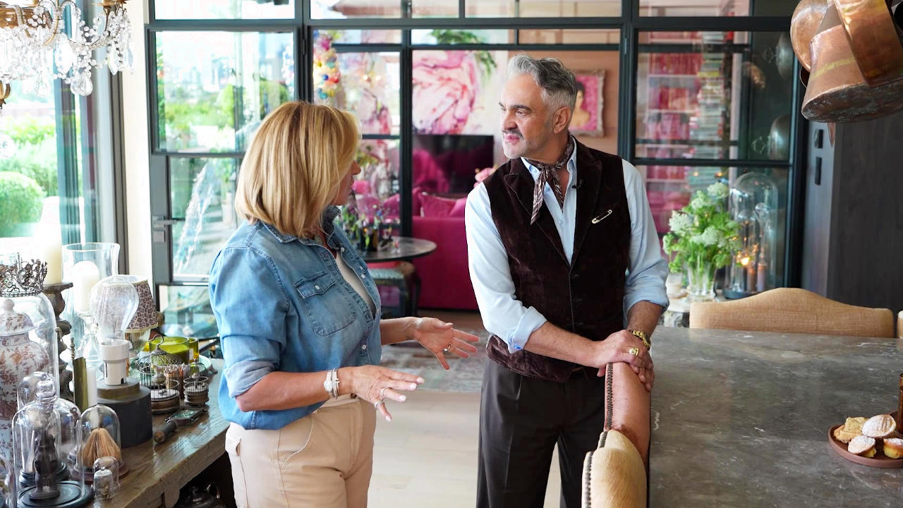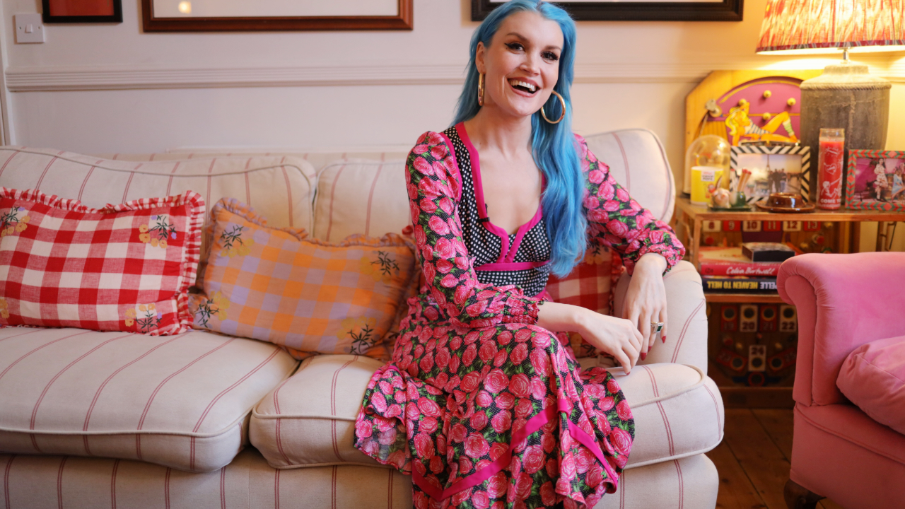



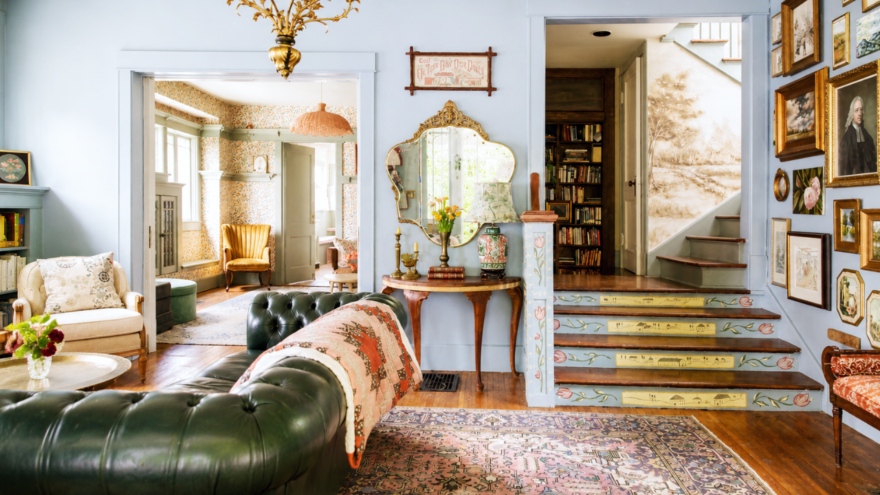

One of the worst design faux pas is buying anything as a set. Of course, there are exceptions—pillows, dishes, and nightstands, among others—but for the most part, a matching set is the aesthetic counterpart of a collected look. And one designer, Sophie von Oertzen Williamson, not only agrees but takes it a step further: She hates matching sets so much that she intentionally designed her home in a way that embraces clashing. She even wrote a book about it called The Art of the Clash. Curious what this looks like? Take a look in her New Canaan, Connecticut, home, where clashing is actually working.
“My sense of style is really the art of the clash. I am not taking credit for this. I did not come up with this sentence myself, but somebody described my style like this, and I was like, ‘Yes, that’s what it is,'” she starts. “It’s so important to create tension so that your eye can travel.” And that’s exactly what she does in her home: creates tension. The key is creating anchors in the room that play off each other without competing.
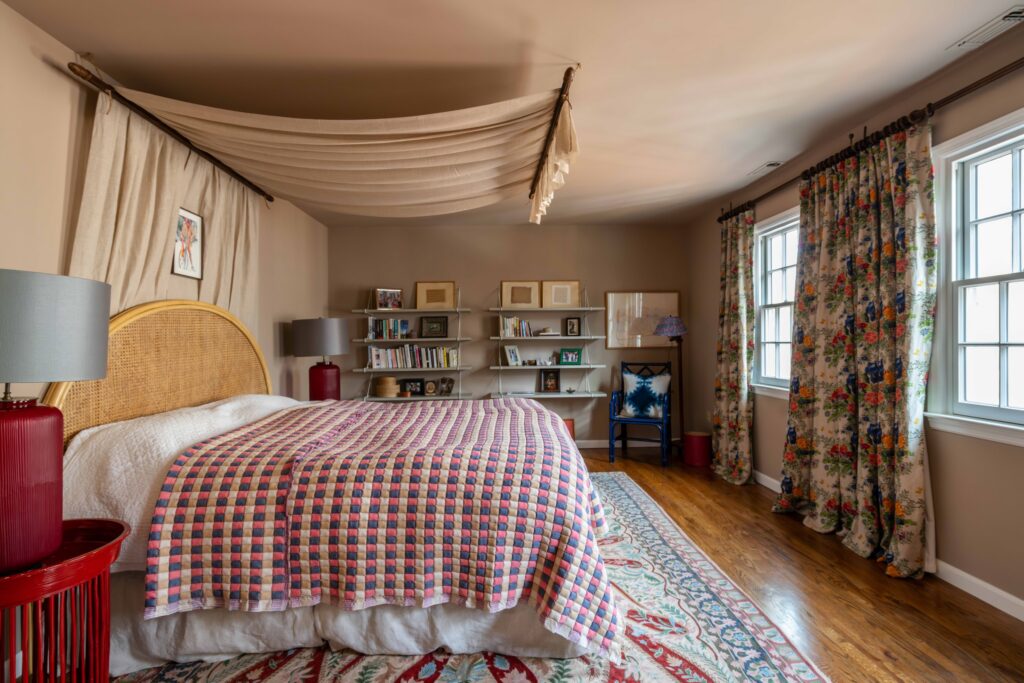
Each room, while different, follows the same philosophy: Create a palette, layer patterns, and choose a few “wow” pieces. Her process is perhaps most evident in her bedroom, which features a very 1950s-inspired palette; a checked, floral, and motif pattern; and the canopy over a caned headboard. “Here’s the story with the canopy bed: We had these extremely cool curtain rods from my parents-in-law. They’re English,” she says. “We used them in the entire room because the brown just makes it so cozy and wonderful. And then these are just linen curtains.”
She also makes the excellent point that using something you already own in a different space makes it look like a completely different product, which is the case with this headboard. “This bed was one that I got in Singapore from my great friend Joanna, who has a wonderful store called The Jungle Emporium. We shipped it to America, and I used it in [my previous home] and then reused it here. It looks completely different.”
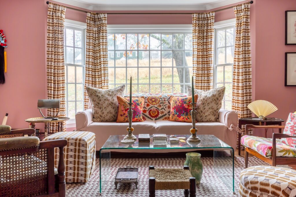
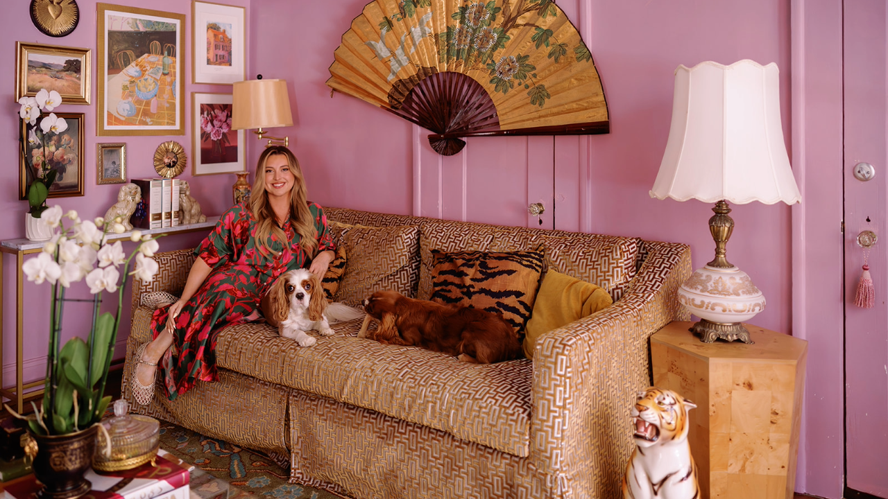
Pink paint is a bold choice because, unlike white or even blue, pink can go wrong easily: Too much of a blue undertone makes it look a bit too juvenile and a bit too warm, and it can go too cocktail-bar. Luckily, Sophie knew this, so before committing to a pink—Hellebore by Little Greene—she tested 12 options. “I test it out around the windows, around the door frames, and all over, and I live with it for at least two weeks to see where the sun falls.”
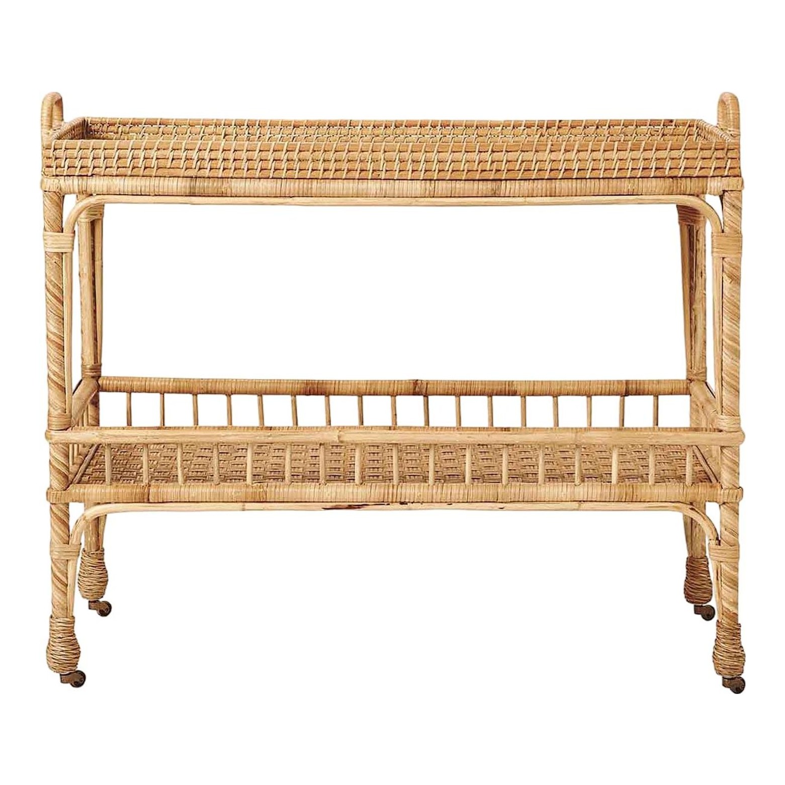
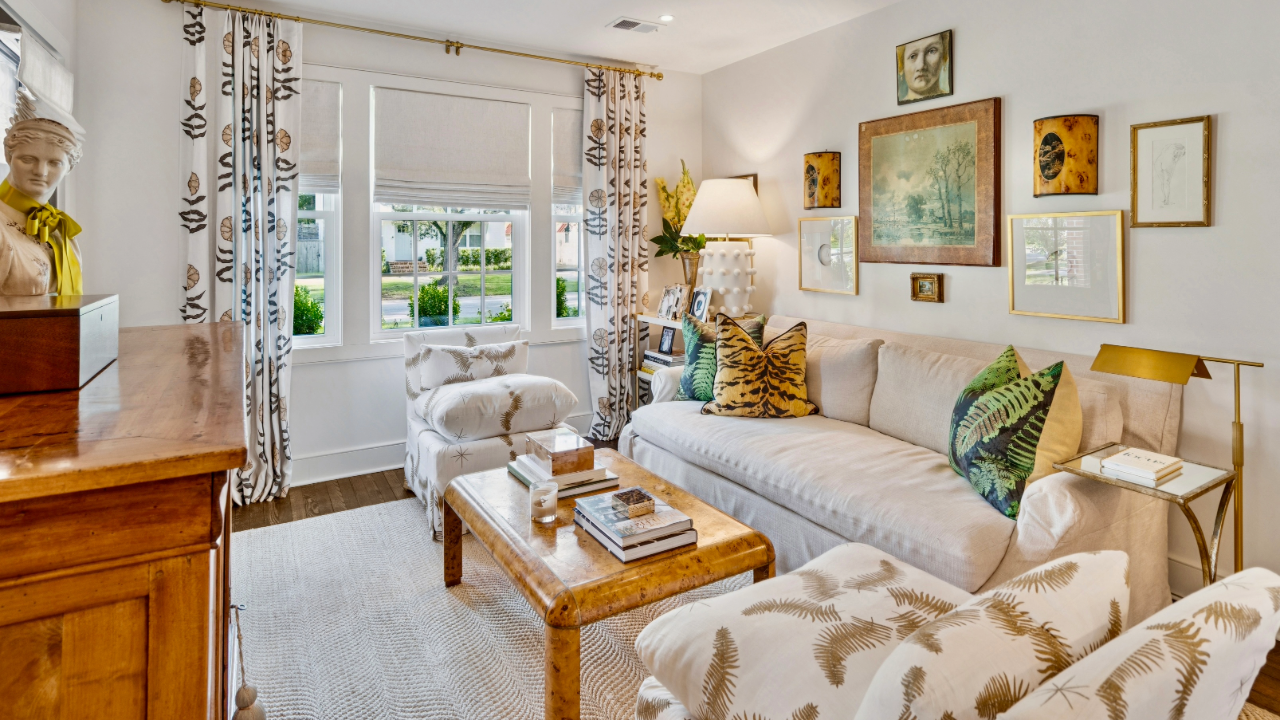
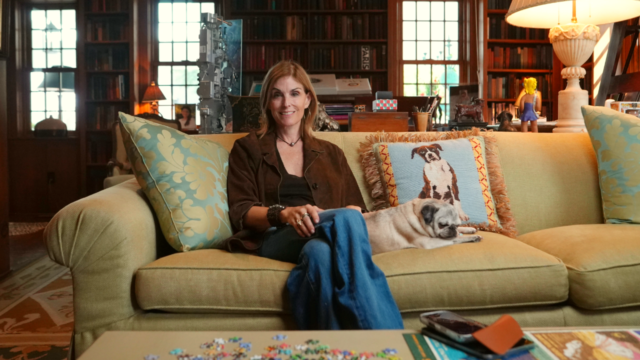
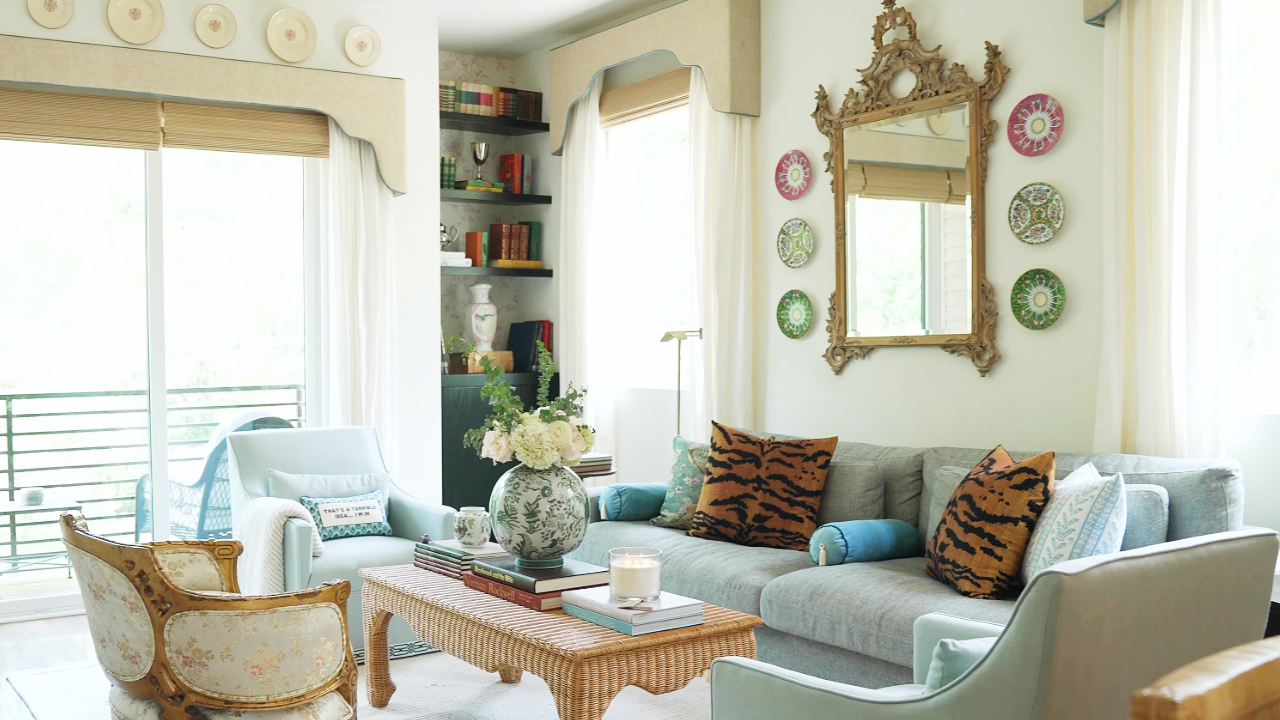
Plus, here is where the idea of the “clash” comes into play. There’s no one specific style to pinpoint here, or anywhere in her home for that matter, since everything is from a different country, shop, and time period. In the living room, for instance, there is a 1950s bar cart, a midcentury Stiffel lamp, inherited objects, a Facebook Marketplace roll-arm sofa, and a 1980s-style waterfall coffee table.
As any designer will admit, you can have a plan for a room, and one piece will blow it all up. “Originally, I was thinking for this room, ‘Okay, we’re going to really lean heavily into the cottage style,’ but when I found this coffee table, I immediately knew that this was it.” She ended up styling quite a bit around the table, which totally changed the look of the space. “And you can kind of style it in a different way, and it just picks it up and doesn’t make it too sweet. This is important to me.”
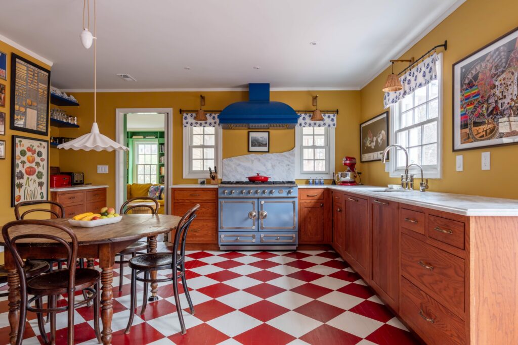
Unlike the rest of the rooms, the kitchen required structural changes in addition to cosmetic ones. She wanted it to be fully functional and eat-in, but she also needed a bit more flow. Her first order of business was removing the island. Next, she added more windows. “Kitchens are something so personal, and I knew what I wanted,” she insists. “The main thing was to make it light and airy in any way that we could because we love an eat-in kitchen.” What’s more, Sophie didn’t really need a breakfast nook. “I just need a table and some chairs around it.”
This room also has the most defined palette: There’s the brick-red on the floor, the royal blue on the range hood, and the mustard yellow on the walls. Plus, it all comes together with the pastel range, which gives this kitchen an undeniable 1950s feel. “This is quite the funky kitchen. I know this,” she adds.